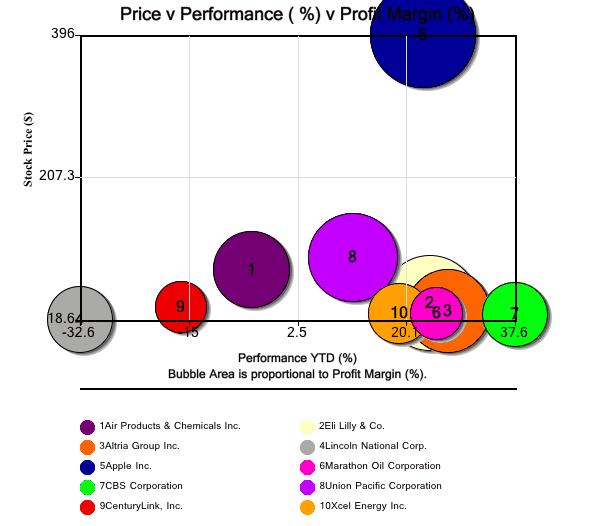
Posted on Dec 23, 2011 by
George F Huhn
In today’s bubble chart, we look at several views of Bank of America’s Top 10 stock picks for 2012. Source: Bank of America, Equity and Quant Strategy In the first bubble chart, the x-axis displays performance year-to-date (%); the y-axis displays current price; and the bubble area represents the latest reported profit margins. Since Apple […]
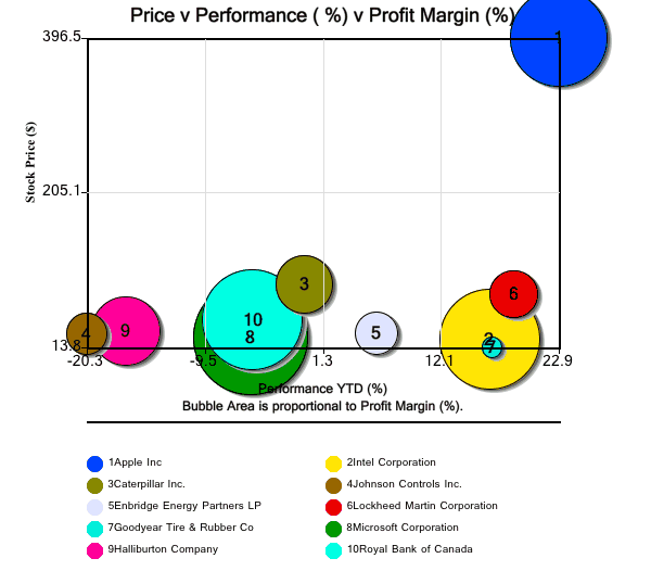
Posted on Dec 22, 2011 by
George F Huhn
In today’s bubble chart, we look at several views of CNN Money’s Top 10 stock picks for 2012. Source: Money.CNN.com In the first bubble chart, the x-axis displays performance year-to-date (%); the y-axis displays current price; and the bubble area represents the latest reported profit margins. Since Apple is priced so much higher than the […]
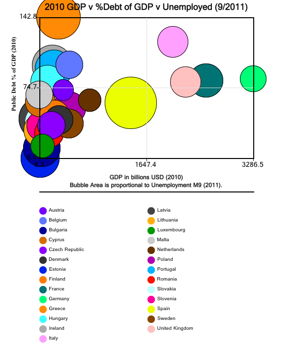
Posted on Dec 8, 2011 by
George F Huhn
In today’s bubble chart, we show a comparison of 27 countries in the European zone. The x-axis is Public Debt as a Percent of GDP; the y-axis is the 2010 GDP; and the bubble area represents Percent Unemployment in September 2011. The highest percent unemployment is Spain at 22% The bubble chart below shows a […]