Posted on Jun 28, 2019 by
George F Huhn
It can be hard to see the labels on bubbles when the text is black and the bubble is dark or the label is white and the bubble is light. One color for all bubbles just doesn’t work! In version 8, you’ll be able to select different colors for your bubble labels and preview them […]
Posted on Nov 6, 2015 by
George F Huhn
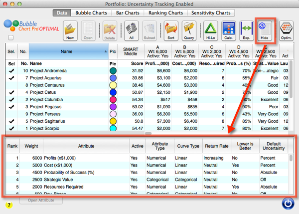
Bubble Chart Pro 6.4 update was just released, and contains many new features and user interface improvements. In particular, we’ve added a new Attribute Summary Table that toggles open at the bottom of the Portfolio form. This allows project portfolio managers to compare all the attributes in a single table, including attribute weights, types, curve […]
Posted on May 27, 2015 by
George F Huhn
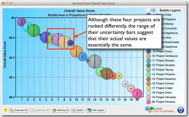
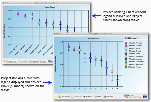
Figure 1: A Project Ranking Chart displaying Uncertainty Bars. You know that making project portfolio decisions requires making predictions about the future. Predictions about timing, markets, costs, ROI, etc. And these predictions usually involve a single value, percentage, or date. And most of the time, they’re wrong. But, Bubble Chart Pro™ OPTIMAL can help you […]
Posted on May 20, 2015 by
George F Huhn
I am pleased to announce that Bubble Chart Pro™ Version 6 has been released, and it is full of new features to help make your business data analysis faster and easier and your presentations and reports more persuasive and insightful. Now in version 6 you can: Instantly see your projects ranked against whatever attribute you […]
Posted on Feb 5, 2015 by
George F Huhn
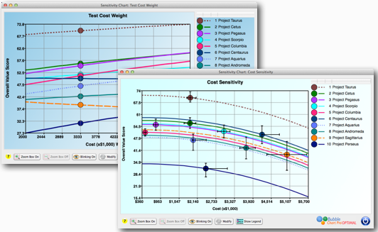
Being able to understand and predict the impact of change in your project portfolio and your portfolio model is essential in building a robust project portfolio model. In Bubble Chart Pro Version 6, you’ll be able to use new sensitivity charts to quickly see how changes in your projects or portfolio model can change your […]
Posted on Jan 28, 2015 by
George F Huhn
Visualizing project ranking is going to be incredibly easy and powerful in Bubble Chart Pro Version 6. In just a few clicks, you’ll be able to create charts that show the “most-likely,” “best,” and “worst” outcomes for your projects displayed in prioritized project order from highest to lowest. Prioritizing projects is one of the biggest […]
Posted on Jan 22, 2015 by
George F Huhn
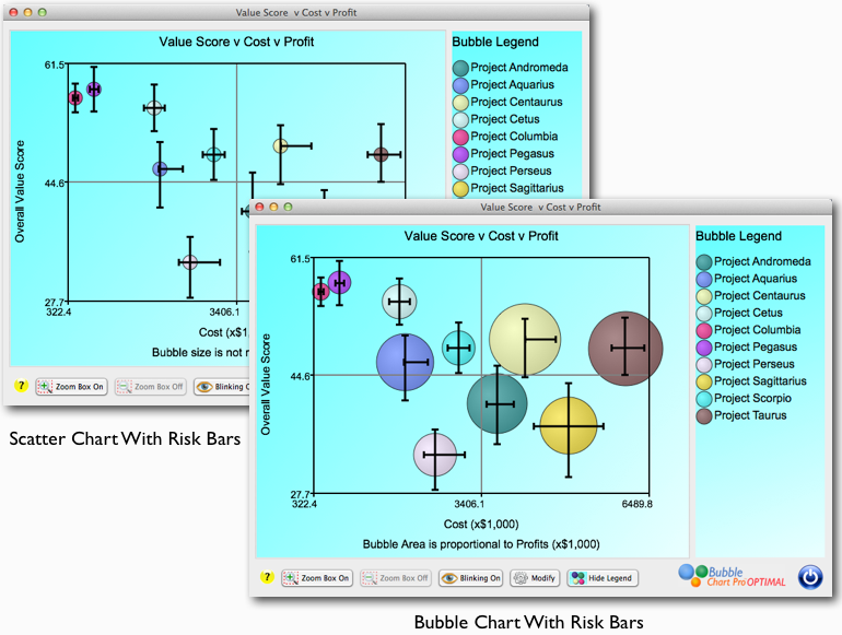
Projects rarely finish exactly on-budget or on-time, which is why it is important to be able see a range of different scenarios for your project portfolio relative to the risks associated with each project. In the upcoming Version 6 edition of Bubble Chart Pro, you’ll be able to do just that. Instead of seeing only […]
Posted on Oct 29, 2014 by
George F Huhn
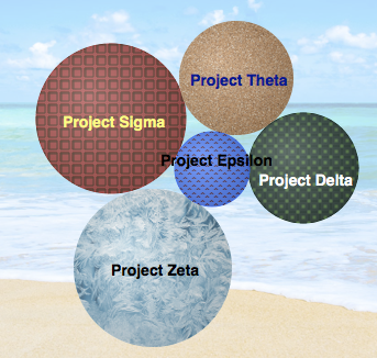
Happy Halloween from Bubble Chart Pro!
Posted on Oct 17, 2013 by
George F Huhn
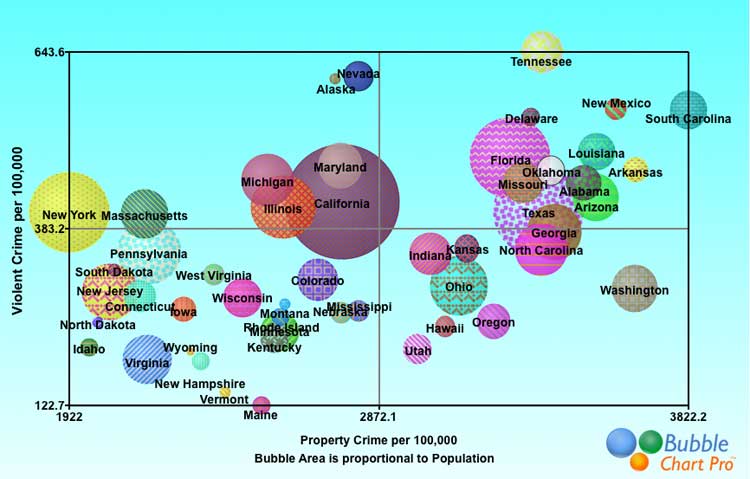
Annual FBI statistics on violent and property crime show the rate of each type of crime per 100,000 residents by state. This bubble chart shows violent crime per 100,000 residents on the y-axis and and property crime per 100,000 residents on the x-axis. Bubble size represents population. By combining the violent and property statistics for […]
Posted on Oct 11, 2013 by
George F Huhn
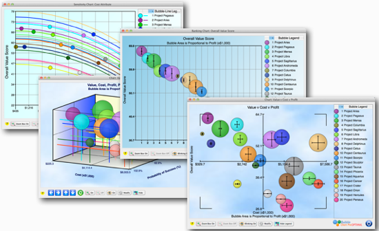
The most valuable chart in project portfolio management is the bubble chart that simultaneously shows you the cost, risk, net present value (NPV) (or other value measure), and overall value score for each project in your portfolio. This chart lets you instantly see the most critical relationships in your project portfolio, and is irreplaceable in […]