Posted on Mar 28, 2012 by
George F Huhn
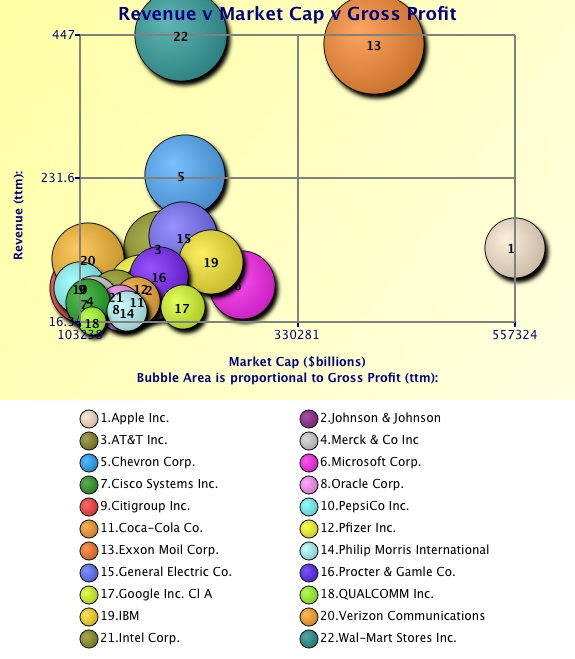
I read a Market Watch blog post that pointed out that Apple has a market cap that is 1.4 times Exxon Mobil’s and twice the market cap of GE’s. These bubble charts compare 22 of the 26 companies with market caps over $100 billion to see why. (Some comparable financial data wasn’t available for 4 of […]
Posted on Mar 26, 2012 by
George F Huhn
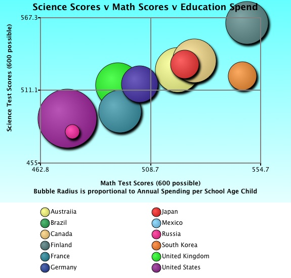
Today’s bubble chart illustrates the relationship between annual education spending and science and math test scores for 12 countries. Here, the x-axis represents math test scores; the y-axis represents science test scores; and the bubble radius represents annual education spending per child. This first chart (above) uses a zoom-box to expand the view of the […]
Posted on Mar 22, 2012 by
George F Huhn
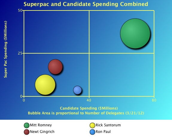
The candidates themselves aren’t the only ones spending big bucks to get convention delegates. The Super Pacs, ostensibly independent fund-raising organizations, are also spending $10’s of millions to influence the election. Mitt Romney is the clear winner in the Super Pac race with $36.6 million spent to-date on his behalf. That comes out to about […]
Posted on Mar 21, 2012 by
George F Huhn
Buying delegates for the Republican Presidential nomination is expensive. Even though he has smallest number of delegates in this bubble chart, Ron Paul has spent the most per delegate: about $660,000 per delegate for his 50 delegates. Rick Santorum has spent the least: about $50,000 for each one of his delegates. Mitt Romney has spent […]
Posted on Dec 23, 2011 by
George F Huhn
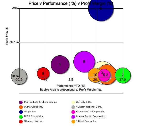
In today’s bubble chart, we look at several views of Bank of America’s Top 10 stock picks for 2012. Source: Bank of America, Equity and Quant Strategy In the first bubble chart, the x-axis displays performance year-to-date (%); the y-axis displays current price; and the bubble area represents the latest reported profit margins. Since Apple […]
Posted on Dec 7, 2011 by
George F Huhn
In today’s bubble chart, we show a comparison of 11 computer chipmaker stocks. The X-axis is stock price; the y-axis is price-to-earnings (p/e); and the bubble area represents market cap.
Posted on Dec 7, 2011 by
George F Huhn
In today’s bubble chart, we show a comparison of 14 computer hardware stocks. The X-axis is stock price; the y-axis is price-to-earnings (p/e); and the bubble area represents market cap. The chart below shows a “zoom-box” detail of the relatively lower p/e and lower priced companies clusterd together in the lower left corner of the […]