Posted on Oct 13, 2012 by
George F Huhn
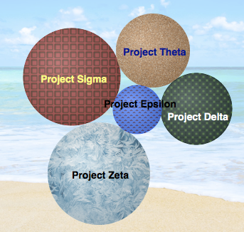
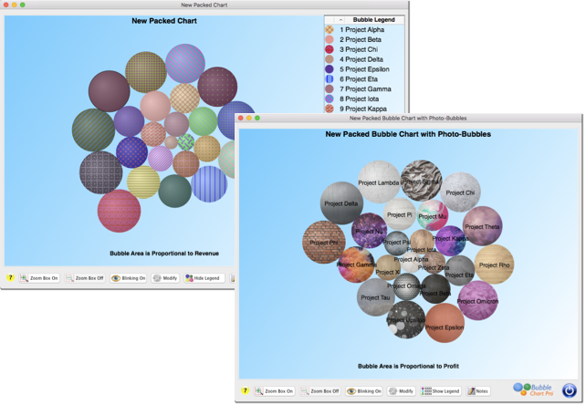
We love new feature suggestions from our users, and we are pleased to introduce the three most requested bubble chart features in Bubble Chart Pro 4. The first most requested feature was the capability to automatically label the bubbles in bubble charts by displaying the project names on top of the bubbles. You can do […]
Posted on Sep 17, 2012 by
George F Huhn
In some cases, the answer is “yes.” In a study of economists summarized in the HBR Blog Network entitled “Economists Are Overconfident. So Are You,” Justin Fox describes a study where economists were asked to make predictions based on analyzing numerical data alone, analyzing numerical data and scatter graphs, or analyzing just the scatter graphs. […]
Posted on Jul 8, 2012 by
George F Huhn
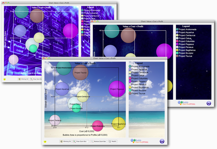
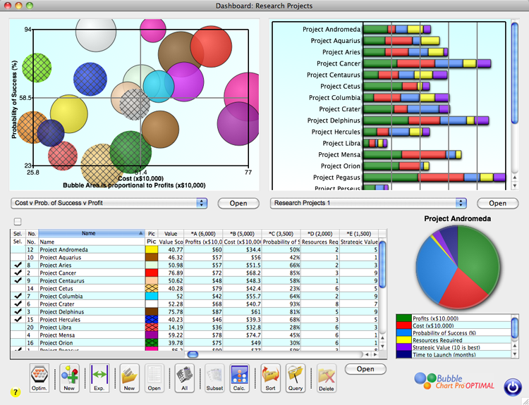
We just launched Bubble Chart Pro™ Version 3.5, which adds a couple of great new features. First, in Bubble Chart Pro™ PLUS and Bubble Chart Pro™ OPTIMAL, you can now open your project portfolios in a Project Portfolio Dashboard. The Dashboard let’s you view and compare multiple bubble and bar charts in a single form […]
Posted on Jun 15, 2012 by
George F Huhn
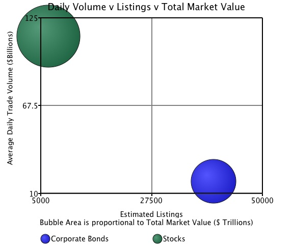
The difference in the U.S. Stock and Bond Markets is striking. Although the total market value for stocks is slightly over twice that for bonds ($17 trillion versus 8.1 trillion), there are over 6 times the number of bond listings versus stock listings, yet the average daily volume in stocks is almost 10 times the […]
Posted on Apr 27, 2012 by
George F Huhn
We just launched Bubble Chart Pro™ Version 2.5, which adds some of our users most requested new features including: Easy chart resizing by dragging the corner of the bubble chart window Project columns in the Portfolio form are locked so they are always visible when scrolling the attributes Bubble transparency has been added as a […]
Posted on Apr 14, 2012 by
George F Huhn
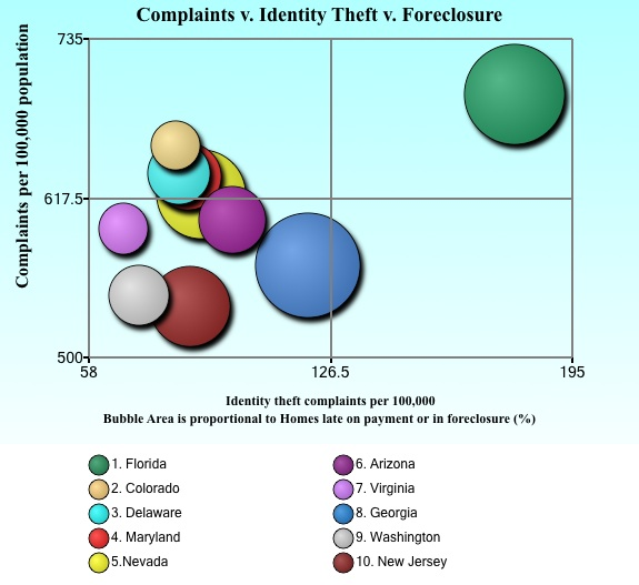
24/7 Wall Street compiled a list of “America’s Ten Most Fraud-Ridden States” from the U.S. Federal Trade Commission’s Consumer Sentinel Network Databook report (CSN). 24/7 Wall Street picked the ten states with the largest percentage of total complaints per 100,000 people and noted that states with large retirement populations were high on the list for fraud. They […]
Posted on Apr 5, 2012 by
George F Huhn
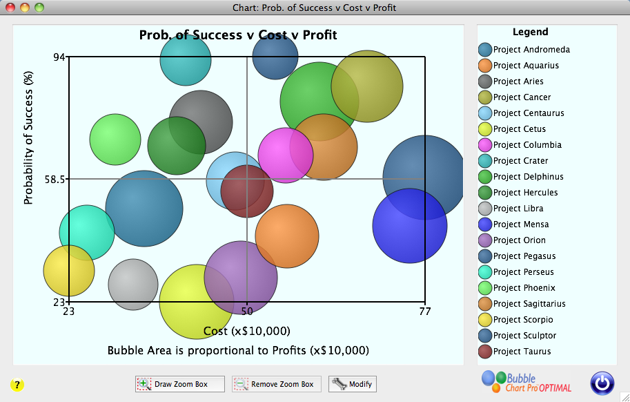
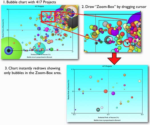
How do you analyze a crowded bubble chart? The bubble chart above has 417 bubbles with many overlapping bubbles and a wide range of bubble sizes. Bubble Chart Pro™ makes it easy to analyze the chart using “Zoom Boxes.” By clicking on a selected point of the chart and dragging the mouse to another point, […]
Posted on Mar 21, 2012 by
George F Huhn
Buying delegates for the Republican Presidential nomination is expensive. Even though he has smallest number of delegates in this bubble chart, Ron Paul has spent the most per delegate: about $660,000 per delegate for his 50 delegates. Rick Santorum has spent the least: about $50,000 for each one of his delegates. Mitt Romney has spent […]
Posted on Jan 1, 2012 by
George F Huhn
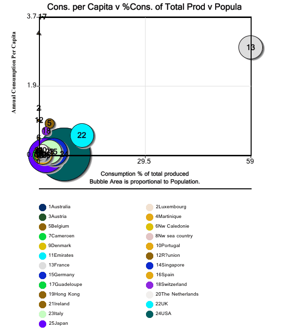
Happy New Year! Today’s bubble chart is a bubble chart of the bubbly: we look at the champagne consumption of the top 25 champagne-drinking countries. Source: Champagne Pages In the first bubble chart, the x-axis displays champagne consumption as a total of the % produced annually; the y-axis displays the average consumption per capita; and […]
Posted on Dec 29, 2011 by
George F Huhn
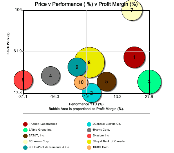
In today’s bubble chart, we look at several views of TheStreet.com’s Top 10 stock picks for 2012. Source: 10 ‘High-Quality’ Stocks for 2012 In the first bubble chart, the x-axis displays performance year-to-date (%); the y-axis displays current price; and the bubble area represents the latest reported profit margins. Interesting to note that half of […]