Posted on Sep 23, 2013 by
George F Huhn
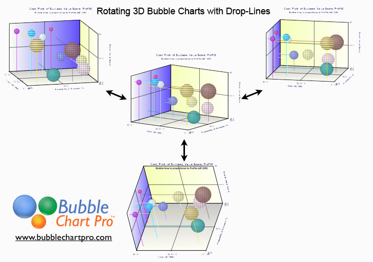
3D bubble charts are particularly useful for looking at projects and business investments simultaneously in dimensions of costs, risks, rewards, and benefits. However, unlike 2D charts, there generally isn’t a single view that lets you see all of the relationships at once because bubbles hide behind other bubbles and it can be difficult to see […]
Posted on Sep 20, 2013 by
George F Huhn
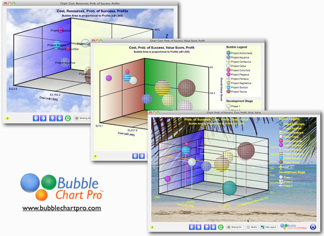
I am pleased to announce the introduction of 3D bubble charts in Bubble Chart Pro™ version 5.2! 3D bubble charts let you plot 4 data sets in a single chart. In addition to the X and Y axes and bubble size, 3D bubble charts display a third dimension: the Z-axis. 3D bubble charts let you […]
Posted on Sep 14, 2013 by
George F Huhn
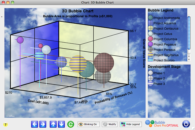
The development of 3D bubble charts for the next version of Bubble Chart Pro™ is almost complete. This is a screenshot of the final 3D bubble chart form. Like our other bubble charts, the 3D bubble charts will be fully customizable including the ability to select the colors for the 3 grids, and to toggle […]
Posted on Sep 4, 2013 by
George F Huhn
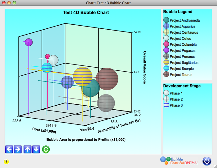
3D bubble charts let you look at 4 dimensions of data in a single chart. Data is represented by the X, Y, and Z-axes and the bubble size. In the prototype chart pictured, the most desirable quadrant is the upper-left-front quadrant – these are the projects with combined lower costs (X-axis), higher success probabilities (Y-axis), […]