Posted on Oct 23, 2013 by
George F Huhn
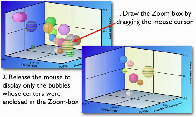
I had a couple of requests for the same type of zoom-boxes that we have for 2D bubble charts to be added to the new 3D bubble charts. Therefore, we have added zoom-boxes to 3D Bubble Charts in Bubble Chart Pro™ version 5.3. Click on the 1-minute video below to watch a demonstration of how […]
Posted on Oct 17, 2013 by
George F Huhn
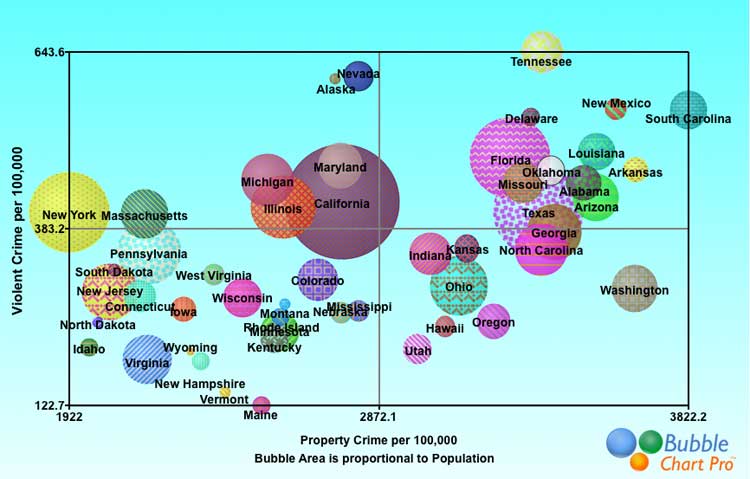
Annual FBI statistics on violent and property crime show the rate of each type of crime per 100,000 residents by state. This bubble chart shows violent crime per 100,000 residents on the y-axis and and property crime per 100,000 residents on the x-axis. Bubble size represents population. By combining the violent and property statistics for […]
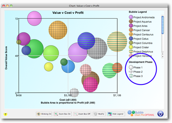
Posted on Oct 11, 2013 by
George F Huhn
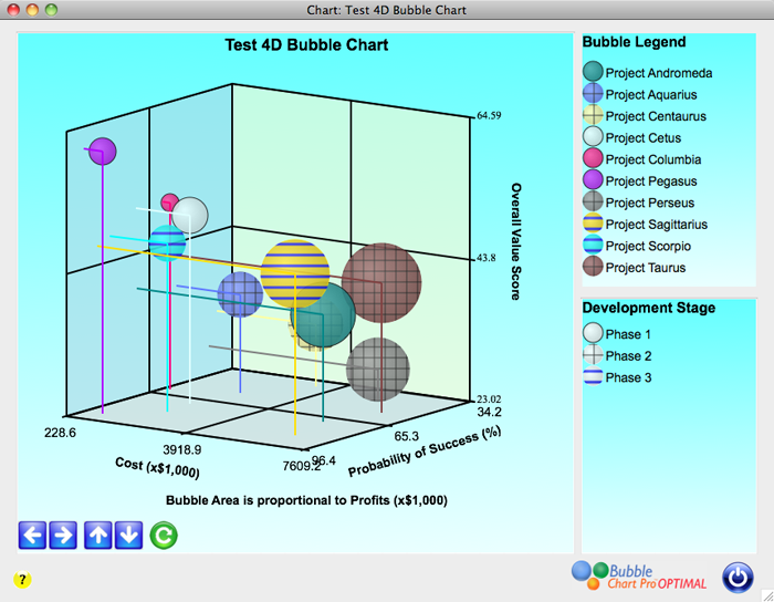
The most valuable chart in project portfolio management is the bubble chart that simultaneously shows you the cost, risk, net present value (NPV) (or other value measure), and overall value score for each project in your portfolio. This chart lets you instantly see the most critical relationships in your project portfolio, and is irreplaceable in […]
Posted on Oct 11, 2013 by
George F Huhn
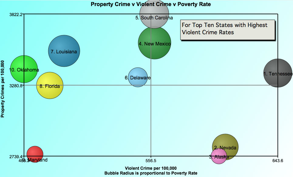
My little home state of Delaware is number 6 on the list of the ten most violent states as per FBI crime statistics published by 24/7. Surprisingly, Tennessee topped the list as the state with the most violent crime per 100,000 people. A bubble chart of the data for these states, with violent crime in […]
Posted on Sep 23, 2013 by
George F Huhn
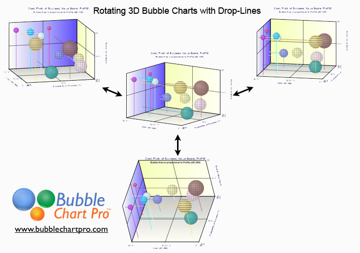
3D bubble charts are particularly useful for looking at projects and business investments simultaneously in dimensions of costs, risks, rewards, and benefits. However, unlike 2D charts, there generally isn’t a single view that lets you see all of the relationships at once because bubbles hide behind other bubbles and it can be difficult to see […]
Posted on Sep 20, 2013 by
George F Huhn
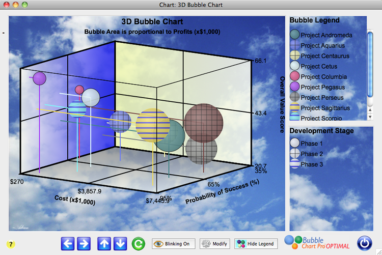
I am pleased to announce the introduction of 3D bubble charts in Bubble Chart Pro™ version 5.2! 3D bubble charts let you plot 4 data sets in a single chart. In addition to the X and Y axes and bubble size, 3D bubble charts display a third dimension: the Z-axis. 3D bubble charts let you […]
Posted on Sep 14, 2013 by
George F Huhn
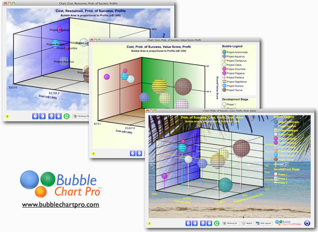
The development of 3D bubble charts for the next version of Bubble Chart Pro™ is almost complete. This is a screenshot of the final 3D bubble chart form. Like our other bubble charts, the 3D bubble charts will be fully customizable including the ability to select the colors for the 3 grids, and to toggle […]
Posted on Sep 4, 2013 by
George F Huhn
3D bubble charts let you look at 4 dimensions of data in a single chart. Data is represented by the X, Y, and Z-axes and the bubble size. In the prototype chart pictured, the most desirable quadrant is the upper-left-front quadrant – these are the projects with combined lower costs (X-axis), higher success probabilities (Y-axis), […]
Posted on Aug 11, 2013 by
George F Huhn
In Version 5.1, we’re introducing “Categories,” a new way to assign values to project attributes in your project portfolios and then plot them in bubble charts. Instead of rating project attributes “on a scale of 1 to 10,” now you can assign categories tied to whatever numerical scale you prefer. For example, in this bubble […]
Posted on Jul 24, 2013 by
George F Huhn
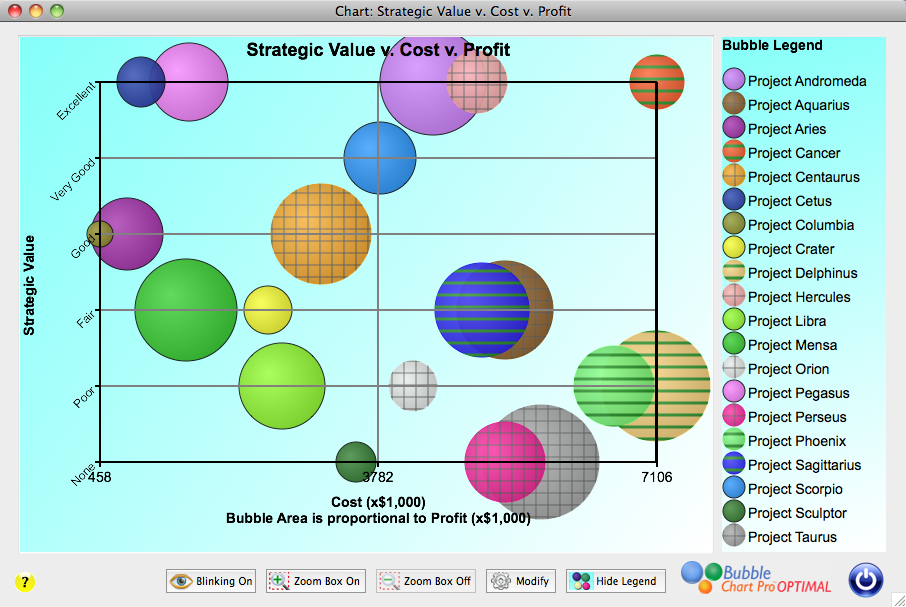
Bubble charts are extremely useful in comparing individual projects in multiple dimensions. Today, with the introduction of custom legends in version 5 of Bubble Chart Pro™, we have made it easy to track groups of projects by assigning pattern and/or color-pattern combinations to custom legend items. For example, if you wanted to track projects by […]