
Figure 1: A new project portfolio bubble chart with center axis.
In project portfolio management, bubble charts are commonly divided into four quadrants to study the relationships between projects. For example, the chart above (Figure 1) compares projects using SMART Values (Y-axis), Cost (X-axis), and Profitability (Bubble Size). The more desirable projects are the larger bubbles (highest profitability) in the lower cost and higher value quadrant (upper left), and the less desirable projects are in the higher-cost and lower SMART Value quadrant (lower right).
As you can see in the example above, we’ll be introducing an axes location preference in Version 6.1 so that you can locate one or both of the axes in the center of the bubble chart.
The chart above is an example of a bubble chart displaying a project portfolio with the axes in the center and the gridlines displayed. Notice how easy it is to identify the quadrants, and that placing the axes in the center of the chart makes it easier to associate each project bubble with the values displayed along each axes.
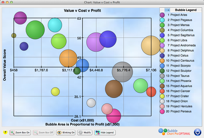
Figure 2: A bubble chart with center axes and gridline display turned off.
The next chart (Figure 3) displays the project portfolio with the X-axis in the center and the Y-axis on the left side. Each axis can be moved independently to the center or edge of the chart.
Figure 3: A bubble chart with center x-axis and Y-axis on the left side.
Figure 4: A traditional project portfolio bubble chart with axes on the left side and bottom of the chart.